Advanced Visualization Packages (SCpubr, SCP, dittoSeq)
Nasir Mahmood Abbasi, PhD
Bioinformatics Educator
Learning Objectives & Prerequisites
- Prerequisites: Complete scRNA-seq Basics and have a QC-reviewed object with clusters, metadata, and marker results.
- Objective: Create readable single-cell figures with SCpubr, SCP, or dittoSeq while selecting colors, comparisons, and labels that support the question.
- Expected Output: A publication-ready figure with color-blind-aware choices, clear axes/legends, caption, and saved code.
Suggested route: use the Bioinformatics Learning Path to review any prerequisite stage before continuing.
Advanced Single-Cell Visualization Packages
The Limitation of Base Seurat
While Seurat's built-in DimPlot and FeaturePlot are great for quick exploration, converting them into flawless, high-contrast, publication-ready figures requires hundreds of lines of complex ggplot2 theme code.
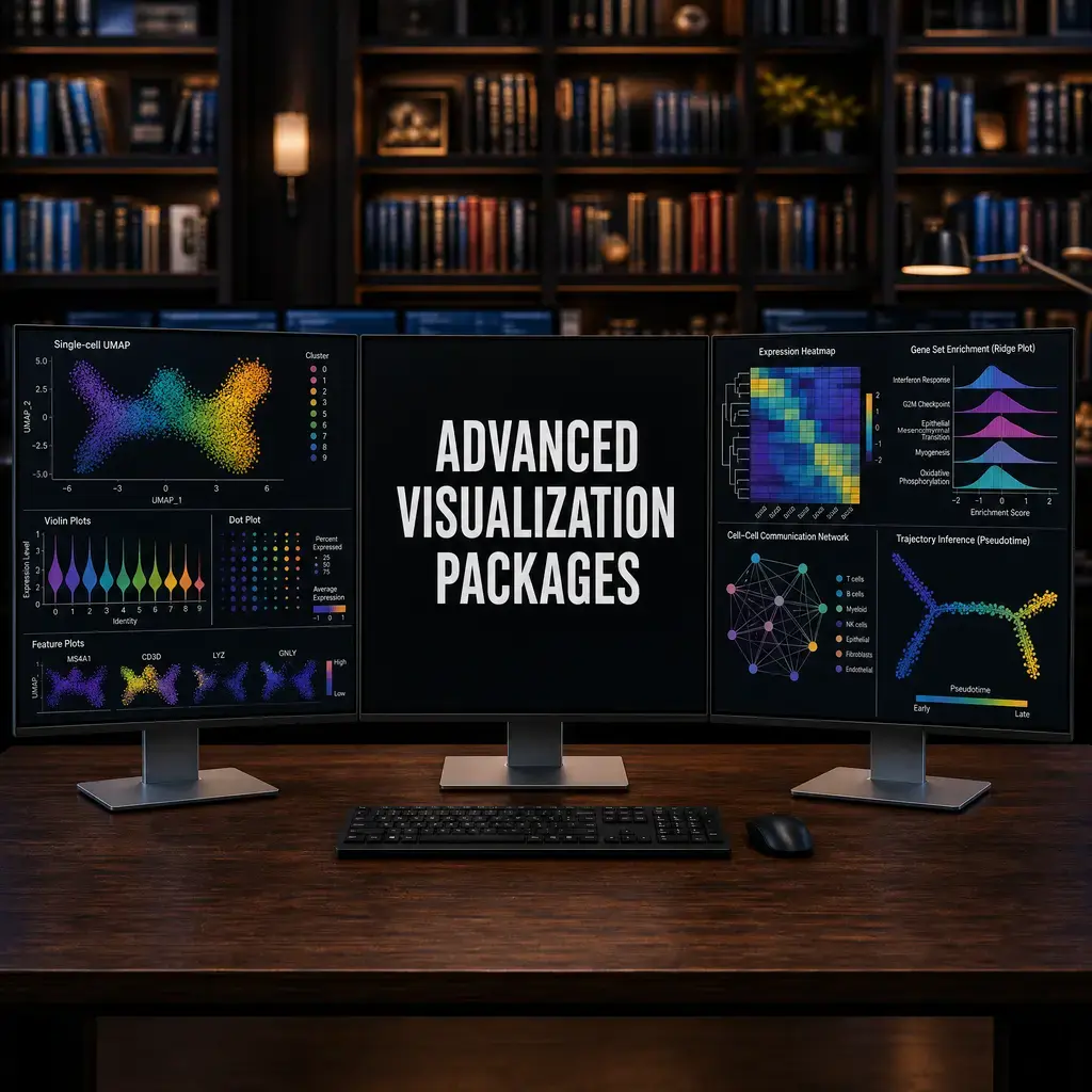
To solve this, the bioinformatics community has developed incredible "wrapper" packages that generate stunning graphics in a single line of code. This masterclass covers the absolute best libraries available.
1. SCpubr (Automated Publication Themes)
SCpubr handles all the complex ggplot2 configurations behind the scenes to generate high-contrast, perfectly scaled plots.
library(SCpubr)

# Generate a premium UMAP with a clean legend and high contrast
SCpubr::do_DimPlot(sample = seurat_obj,
                   group.by = "cell_type",
                   label = TRUE,
                   repel = TRUE,
                   font.size = 14)

# Generate a premium FeaturePlot with a custom color gradient
SCpubr::do_FeaturePlot(sample = seurat_obj,
                       features = "GeneA",
                       colors.use = c("lightgrey", "darkred"))
2. scCustomize (Extended Aesthetics)
scCustomize is highly valued for automatically configuring intuitive color palettes, handling complex multi-gene overlays, and extending Seurat's native functions.
library(scCustomize)

# Create a customized FeaturePlot with a continuous viridis color scale
FeaturePlot_scCustom(seurat_obj, features = "GeneA", colors_use = viridis::viridis(50))

# Create a clustered dot plot (hierarchically grouping both genes and cell types!)
Clustered_DotPlot(seurat_obj, features = top_10_markers, group.by = "cell_type")
3. dittoSeq (Composition & Heatmaps)
dittoSeq is a universal visualization package highly regarded for its color-blind friendly default palettes and its ability to rapidly generate cellular composition barplots.
library(dittoSeq)

# Generate a color-blind friendly cellular composition barplot across samples
dittoBarPlot(seurat_obj, var = "cell_type", group.by = "patient_id")

# Generate a multi-annotation heatmap for top marker genes
dittoHeatmap(seurat_obj, genes = top_10_markers, annot.by = c("cell_type", "condition"))
4. scplotter (Repertoire & Scatter Plots)
scplotter provides an intuitive interface for creating multi-layered visualizations. It is especially powerful for Immune Repertoire (TCR/BCR) plotting and feature-rich scatter plots.
library(scplotter)

# Example: Generate a detailed scatter plot highlighting specific cellular subsets
sc_scatter(seurat_obj,
           group.by = "cell_type",
           split.by = "condition",
           palette = "Set1")
5. SeuratExtend (Pathways & Enrichment)
SeuratExtend bridges the gap between basic Seurat analysis and advanced pathway plotting. It excels at generating GSEA enrichment plots directly from the Seurat object.
library(SeuratExtend)

# Generate a complex Gene Set Enrichment Analysis (GSEA) waterfall plot directly
Plot_GSEA(seurat_obj, pathway = "HALLMARK_HYPOXIA", group.by = "condition")
6. SCP (SingleCellPlot) for Multi-Omics
SCP provides a massive suite of high-level wrappers designed specifically for multi-omics and spatial transcriptomics visualization.
library(SCP)

# Generate a highly annotated, split violin plot for gene expression
CellStatPlot(seurat_obj,
             stat.by = "cell_type",
             group.by = "condition",
             plot_type = "violin")
7. plot1cell & Radar Plots (Complex State Mapping)
When comparing multidimensional signaling states (e.g., GSEA or PROGENy pathway scores across 10 different cell types), standard bar charts fail.
Radar Plots (Spider Plots) allow you to visualize these multi-dimensional states perfectly.
library(ggradar)

# Assuming 'pathway_data' is a data frame of normalized pathway scores per cluster
ggradar(pathway_data,
        grid.min = 0, grid.mid = 0.5, grid.max = 1,
        group.line.width = 1, group.point.size = 3) +
  labs(title = "Pathway Activity Radar Plot")
8. Python (Scanpy) Equivalents
While the highly specialized libraries above (SCpubr, SeuratExtend, scplotter) are built exclusively for R and Seurat, the Python ecosystem (Scanpy and AnnData) has its own powerful visualization equivalents:
- Squidpy: The Python equivalent to SCP for spatial and complex multi-omics visualizations.
- scvi-tools: Offers deep-learning-based latent space visualizations and highly customizable posterior checks.
- Scanpy native plotting (
sc.pl.*): While not as automated for "publication themes" asSCpubr,sc.pl.dotplot,sc.pl.matrixplot, andsc.pl.stacked_violinprovide incredibly robust, dense visual summaries comparable todittoSeq. - CellRank / scVelo: The absolute gold standards in Python for dynamic trajectory and vector field visualizations.
Conclusion
By mastering these 7 packages, you will never need to struggle with raw ggplot2 code again. You can produce complex, publication-ready figures for high-impact journals in a matter of seconds.
Knowledge Check & Assessment
1. Concept Verification
What makes a single-cell visualization interpretable rather than merely attractive?
2. Practical Execution
Recreate one plot from the lesson, improve its labels and color scale, and write a caption that names the data and comparison. Pass Criteria: Record the command or analysis choice, keep the output, and explain why it answers the stated task.
3. Troubleshooting
If a plot is misleading or unreadable, how will you inspect scale transformations, color mappings, sample imbalance, and overplotting?
Reviewed: September 2026
All commands and outputs were verified with the software versions listed in this tutorial. If you encounter reproducibility issues, please report them through the Contact page.
Author: Nasir Mahmood Abbasi, PhD · Category: Advanced Single-Cell Analysis