Data Visualization Fundamentals
Nasir Mahmood Abbasi, PhD
Bioinformatics Educator
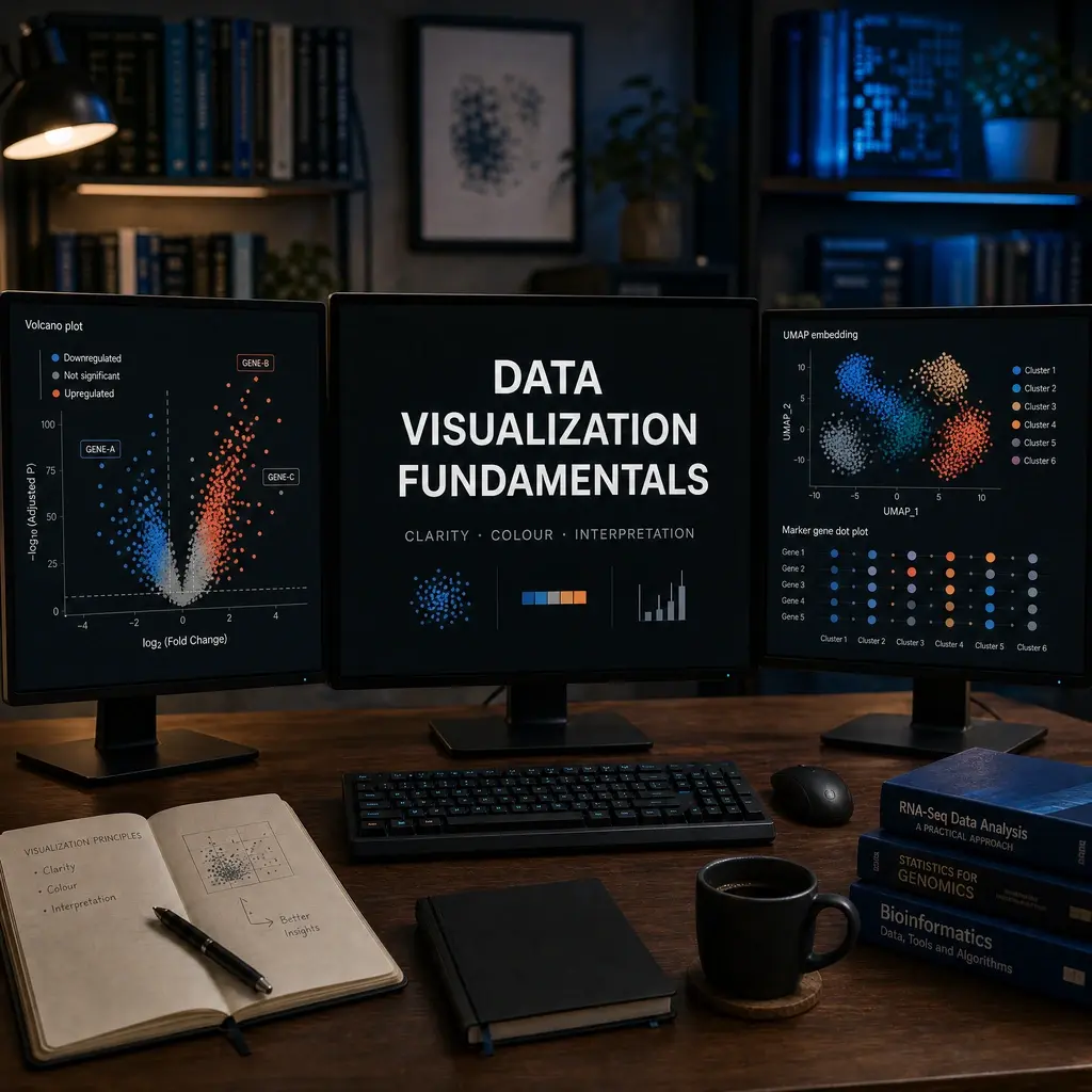
A plot is an argument about data. Good visualization reveals uncertainty, sample structure, and potential artifacts while preserving units and context. This lesson gives learners a practical checklist for reading and creating bioinformatics figures.
Learning Objectives & Prerequisites
By the end of this lesson, you should be able to:
- Select plots that match a question and data type.
- Read distributions, PCA, heatmaps, UMAPs, volcano plots, and coverage plots.
- Use labels, scales, palettes, and legends responsibly.
- Separate visual patterns from statistical and biological evidence.
Prerequisites:
- Basic R or Python plotting.
- Complete Quality Control Fundamentals.
By the end of this lesson, you should have: One publication-ready exploratory plot with labeled axes, a stated colour choice, an interpretation note, and the code used to create it.
1. Start with the question
Use a distribution to inspect spread, a scatter plot to compare measurements, PCA to summarize major variation, a heatmap to inspect patterns, and UMAP to visualize local neighborhoods. No plot proves a mechanism by itself.
import seaborn as sns
import matplotlib.pyplot as plt

# Always label units and groups
sns.boxplot(data=df, x="batch", y="pct_mt", hue="condition", showfliers=False)
sns.stripplot(data=df, x="batch", y="pct_mt", hue="condition", dodge=True, color="black", alpha=0.55)
plt.xlabel("Batch")
plt.ylabel("Mitochondrial reads (%)")
plt.legend(title="Condition")
library(ggplot2)

# Always label units and groups
ggplot(df, aes(x = batch, y = pct_mt, color = condition)) +
  geom_boxplot(outlier.shape = NA) + geom_jitter(width = .15) +
  labs(x="Batch", y="Mitochondrial reads (%)")
2. PCA and UMAP
PCA axes are linear summaries; UMAP is a neighborhood visualization whose geometry depends on parameters. Report preprocessing, dimensions, neighbors, metric, and random seed.
sc.tl.pca(adata, n_comps=30, random_state=7)
sc.pp.neighbors(adata, n_neighbors=15, n_pcs=20, random_state=7)
sc.tl.umap(adata, random_state=7)
3. Heatmaps and volcano plots
Cluster and scale deliberately. A volcano plot combines effect size and significance; a small p-value alone is not a large or meaningful biological effect.
Figure checklist: title, units, n, group definition, preprocessing, color meaning, and scale.
4. Honest visual interpretation
Use colorblind-safe palettes, avoid truncated axes when they mislead, show individual points when possible, and state limitations in the caption.
Caption template: Dataset; preprocessing; n; statistic; software/version; interpretation; limitation.
5. Choosing the Right Plot Type
The most common mistake in data visualization is choosing a plot type that obscures the data's structure. Use this decision guide:
| Question You're Answering | Recommended Plot | Avoid |
|---|---|---|
| How is a single variable distributed? | Histogram, density plot, violin plot | Pie chart |
| How do two continuous variables relate? | Scatter plot, hexbin plot | 3D surface plot |
| How do groups compare? | Box plot, violin plot, dot plot | Bar plot with error bars |
| How does a measurement change over time? | Line plot | Scatter plot without connection |
| What is the composition of categories? | Stacked bar chart, alluvial plot | Pie chart for >5 categories |
| What are the relationships in high-dimensional data? | PCA, UMAP, heatmap | >3 dimensions on cartesian axes |
6. A Complete Plotting Example in Python
import matplotlib.pyplot as plt
import numpy as np
import pandas as pd

# Create example QC data
np.random.seed(42)
qc_data = pd.DataFrame({
    "sample": [f"S{i:02d}" for i in range(1, 13)],
    "total_reads_M": np.random.normal(25, 5, 12),
    "mapping_rate": np.random.uniform(0.85, 0.98, 12),
    "condition": ["control"]*6 + ["treated"]*6
})

# Create a publication-quality figure
fig, axes = plt.subplots(1, 2, figsize=(12, 5))

# Panel A: Read depth per sample
colors = ["#4C72B0" if c == "control" else "#DD8452" for c in qc_data["condition"]]
axes[0].bar(qc_data["sample"], qc_data["total_reads_M"], color=colors)
axes[0].set_xlabel("Sample")
axes[0].set_ylabel("Total Reads (millions)")
axes[0].set_title("A. Sequencing Depth")
axes[0].tick_params(axis="x", rotation=45)
axes[0].axhline(y=20, color="red", linestyle="--", alpha=0.5, label="QC threshold")
axes[0].legend()

# Panel B: Mapping rate distribution by group
for cond, color in [("control", "#4C72B0"), ("treated", "#DD8452")]:
    subset = qc_data[qc_data["condition"] == cond]
    axes[1].hist(subset["mapping_rate"], bins=6, alpha=0.6, color=color, label=cond)
axes[1].set_xlabel("Mapping Rate")
axes[1].set_ylabel("Frequency")
axes[1].set_title("B. Alignment Quality")
axes[1].legend()

plt.tight_layout()
plt.savefig("results/figures/qc_summary.webp", dpi=300, bbox_inches="tight")
plt.show()
7. Color and Accessibility
Approximately 8% of males and 0.5% of females have some form of color vision deficiency. Use colorblind-safe palettes:
# Colorblind-safe palettes
import matplotlib.pyplot as plt

# Option 1: Use built-in colorblind-safe colormap
plt.set_cmap("viridis")

# Option 2: Seaborn colorblind palette
import seaborn as sns
sns.set_palette("colorblind")

# Option 3: Manually specify accessible colors
accessible_colors = {
    "blue": "#0072B2",
    "orange": "#E69F00",
    "green": "#009E73",
    "vermilion": "#D55E00",
    "sky_blue": "#56B4E9"
}
8. Figure Quality Standards
| Requirement | Standard | How to Check |
|---|---|---|
| Resolution | ≥300 DPI for print, ≥150 DPI for web | fig.savefig(..., dpi=300) |
| Format | Vector (SVG/PDF) for figures, WebP/PNG for web | Save both formats |
| Font size | ≥8pt for axis labels, ≥10pt for titles | Set fontsize parameters |
| Axis labels | Include units in parentheses | "Expression (TPM)", "Length (bp)" |
| Legend | Inside or adjacent to the plot area | Never overlapping data points |
| White space | Minimal margins, no excessive padding | bbox_inches="tight" |
Practical Exercise
Create one QC plot and one between-group plot using a small table. Add a caption that states n, units, preprocessing, and one limitation.
Pass criteria: A reader can understand the axes, groups, sample count, and what the figure does not prove.
Troubleshooting
If colors are indistinguishable, use a palette designed for color-vision accessibility and add shapes or labels rather than relying on color alone.
Knowledge Check & Assessment
1. Concept Verification
Write short answers explaining the main concepts, the assumptions behind them, and one way a careless workflow could produce a misleading result.
2. Practical Execution
Complete the practical exercise above and save the command, script, table, or figure in the project structure. Pass Criteria: A reader can understand the axes, groups, sample count, and what the figure does not prove.
3. Troubleshooting
Explain what you would inspect first if the output were empty, malformed, unexpectedly large, or failed because of a missing file, package, permission, memory, or metadata problem.
Next Steps
Continue with scRNA-seq Basics and Research Reporting and Interpretation. Record the software versions, dataset or example inputs, and any decisions you made.
Reviewed: July 2026
All commands and outputs were verified with the software versions listed in this tutorial. If you encounter reproducibility issues, please report them through the Contact page.
Author: Nasir Mahmood Abbasi, PhD · Category: Foundations & Prerequisites